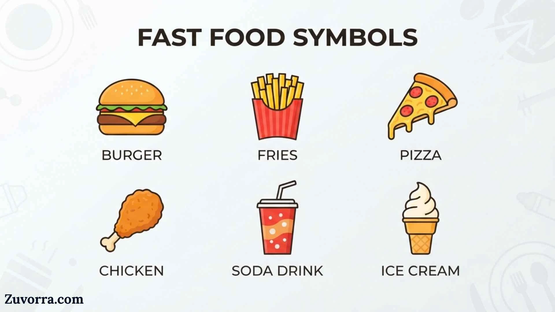
Fast food symbols are visual signs that help people recognize restaurants, foods, services, and dining experiences almost instantly. A pair of golden arches can suggest McDonald’s, a white-haired colonel represents KFC, and a stylized bell points to Taco Bell. Beyond brand logos, burgers, fries, pizza slices, drink cups, chickens, crowns, stars, and drive-thru arrows also communicate familiar ideas.
These symbols matter because customers often see them before reading a restaurant’s name. Their shapes and colors can suggest speed, affordability, warmth, freshness, tradition, or indulgence. This guide explains where fast food symbols came from, what they mean, why certain designs appear repeatedly, and how they function in modern culture.
Quick Meaning
Fast food symbols are logos, mascots, food icons, colors, signs, and packaging designs used to represent quick-service restaurants and their products. They commonly symbolize speed, convenience, recognizable taste, affordability, familiarity, and instant satisfaction. Their meaning usually comes from branding and consumer experience rather than ancient, religious, or universal symbolism.
Fast Food Symbols Overview
| Field | Details |
| Symbol category | Commercial, culinary, directional, and cultural symbols |
| Primary meaning | Quick, convenient, recognizable prepared food |
| Common forms | Burgers, fries, pizza slices, cups, crowns, bells, arches, stars, mascots |
| Historical roots | Roadside restaurants, diners, drive-ins, advertising, and trademark design |
| Major period of growth | Mid-20th century, alongside automobiles and restaurant franchising |
| Common colors | Red, yellow, orange, white, green, brown, and black |
| Main settings | Storefronts, highways, menus, packaging, mobile apps, maps, and advertisements |
| Modern meaning | Fast service, predictable food, brand identity, delivery, and digital ordering |
| Unicode examples | |
| Related symbols | Restaurant signs, delivery icons, drive-thru arrows, utensils, chef mascots |
What Do Fast Food Symbols Mean?
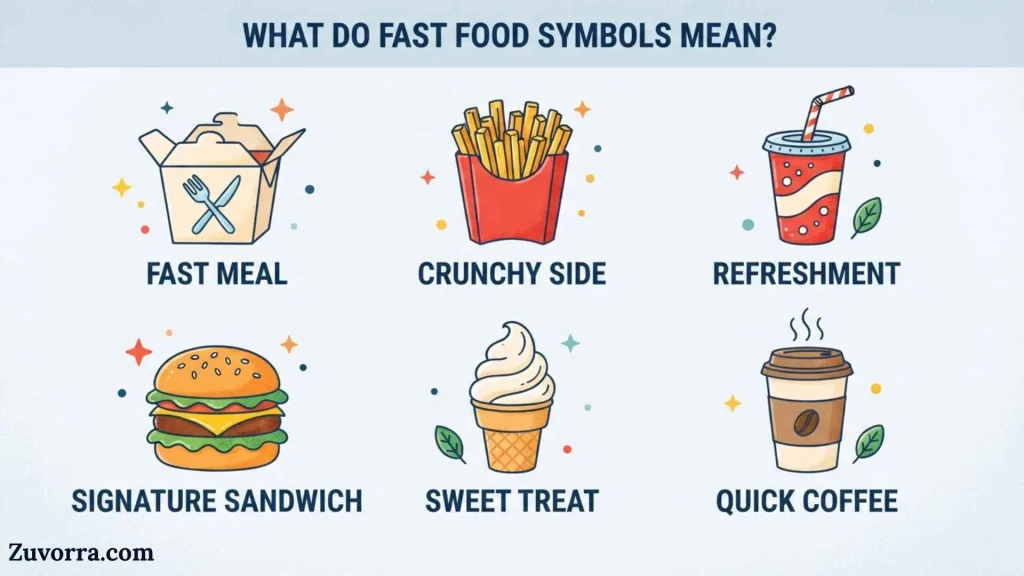
Fast food symbols primarily mean that prepared food is available quickly and conveniently. They allow customers to recognize a restaurant, product, or service without needing to read a long explanation.
The phrase includes several kinds of visual communication:
Restaurant logos
A restaurant logo identifies a specific business. McDonald’s Golden Arches, KFC’s Colonel Sanders portrait, Burger King’s crown-related identity, and Wendy’s red-haired girl distinguish one restaurant from another.
Food pictograms
Icons such as a hamburger, pizza slice, chicken leg, taco, or fries communicate the type of food being sold. These signs are especially useful on maps, menu boards, airport directories, and mobile apps.
Service icons
Cars, arrows, clocks, shopping bags, delivery scooters, and smartphone symbols tell customers how they can buy food. They may represent drive-thru service, takeout, delivery, mobile ordering, or late-night availability.
Mascots
A mascot gives a restaurant a human, animal, or fictional personality. Mascots often suggest friendliness, tradition, humor, expertise, or family appeal.
Fast food symbolism is therefore practical rather than mystical. Its purpose is to make a message easy to understand, remember, and act upon.
History and Origin of Fast Food Symbols
Modern fast food symbols developed alongside restaurants designed for motorists. During the early and middle decades of the 20th century, roadside businesses needed signs that drivers could recognize from a distance. Large letters, bold shapes, bright colors, and memorable characters became valuable tools.
Roadside architecture became advertising
Early restaurant buildings sometimes functioned as symbols themselves. Towers, arches, oversized signs, neon lighting, and unusual rooflines helped businesses stand out along busy roads.
The original McDonald’s red-and-white tiled restaurant, designed by architect Stanley Meston in 1953, included large yellow arches as architectural features. The arches later became part of the company’s visual identity, and McDonald’s officially adopted the Golden Arches as its logo in 1962.
This development shows an important feature of fast food symbolism: a physical object can gradually become an abstract mark. What began as part of a building became an “M” recognized independently of the restaurant structure.
Franchising increased the need for consistency
As quick-service chains expanded, they needed every location to look connected. A reliable logo, color palette, mascot, and sign system helped customers expect a similar experience in different cities.
McDonald’s history illustrates this relationship between consistency and recognition. The company describes Ray Kroc’s goal as building a restaurant system that offered consistently prepared food across locations.
Visual consistency supported operational consistency. When customers saw the same sign, they expected familiar menu items, prices, service methods, and surroundings.
Television gave mascots greater power
Television advertising made restaurant characters more influential. A mascot could appear in commercials, packaging, toys, restaurant décor, and printed promotions.
KFC’s symbol differs from a fictional mascot because it represents a real founder. Colonel Harland Sanders remains central to the company’s logo even as its design changes. KFC states that his face has stayed at the forefront of the brand’s identity through multiple logo adaptations.
Digital ordering simplified symbols
Mobile apps introduced a new visual challenge: logos had to remain clear at very small sizes. Many brands responded with simpler shapes, reduced detail, flat colors, and recognizable initials.
Modern fast food symbols must work on:
- Roadside signs
- Food wrappers
- Smartphone screens
- Delivery platforms
- Social media profiles
- Digital menu boards
- Loyalty-program icons
A successful symbol now needs to communicate at both architectural and thumbnail scale.
Symbolism and Interpretation
Fast food imagery has no single universal meaning. Its interpretation depends on shape, color, context, brand history, and the viewer’s personal experiences.
Speed and convenience
Arrows, motion lines, clocks, vehicles, and simplified food icons suggest quick movement. They support the central promise that customers can order, receive, and eat food with limited delay.
Familiarity and predictability
Repeated logos can become symbols of reliability. A traveler who recognizes a chain’s sign may choose it because the menu and ordering process feel familiar.
This predictability can be comforting, particularly in an unfamiliar city, airport, or highway service area.
Pleasure and reward
Burgers, fries, desserts, and soft drinks can symbolize an affordable treat. Advertisements often present these foods as rewards after work, school, travel, shopping, or social activities.
This is an emotional interpretation rather than an objective property of the symbol. The same fries icon may represent enjoyment to one person and an unhealthy habit to another.
Community and shared experience
Buckets, pizza boxes, meal bundles, and tables can represent food intended for groups. KFC has used the bucket as a sign of shared eating and social connection in its marketing.
Tradition and authenticity
Founder portraits, chef clothing, handwritten lettering, shields, seals, and dates may suggest heritage. These elements tell customers that a recipe or business has an established history.
KFC’s Colonel Sanders portrait is a strong example. Because Sanders was a real cook and founder, his image links the modern restaurant chain to its origin story and Original Recipe identity.
Positive meanings
Fast food symbols may positively suggest:
- Convenience
- Fun
- Familiar taste
- Affordable enjoyment
- Family meals
- Travel breaks
- Social gatherings
- Efficient service
Negative meanings
Depending on the context, the same symbols may suggest:
- Overconsumption
- Standardization
- Excess packaging
- Unhealthy eating habits
- Aggressive advertising
- Loss of local food traditions
These negative meanings usually come from social criticism rather than the companies’ intended messages.
The Psychology of Fast Food Colors and Shapes
Color meanings are tendencies, not fixed scientific laws. Culture, contrast, lighting, product photography, and prior brand exposure all influence how people respond.
Red
Red is common in restaurant design because it is vivid and easy to notice. It can communicate warmth, excitement, urgency, energy, or heat. It also stands out well on signs and packaging.
McDonald’s, KFC, Wendy’s, and many pizza chains use red prominently, but the color does not have one exclusive fast food meaning.
Yellow and gold
Yellow can suggest warmth, cheerfulness, visibility, and optimism. Gold can add ideas of importance, success, or a signature identity.
The McDonald’s arches are described as “golden,” although their practical function is also recognition. Their form connects to the architecture of early McDonald’s restaurants and resembles the letter M.
Green
Green often appears in brands that want to emphasize vegetables, freshness, customizable meals, or a more natural atmosphere. However, a green logo does not prove that a meal is nutritionally balanced or environmentally sustainable.
Brown
Brown can evoke grilled food, bread, coffee, wood, earthiness, or tradition. It is common in café, barbecue, bakery, and burger imagery.
Circles
Circles suggest completeness, unity, plates, buns, pizzas, and shared meals. Circular logos also fit signs, stickers, cups, and app icons easily.
Crowns
A crown commonly represents leadership, status, confidence, or the “best” choice. In fast food branding, it may add humor and make an ordinary meal feel more important or indulgent.
Faces
Human faces create personality. A smiling founder or mascot can make a company appear welcoming, experienced, or approachable. Facial symbols are especially memorable when paired with a distinctive hairstyle, hat, glasses, or expression.
Cultural Significance
Fast food symbols operate globally, but people do not interpret them in exactly the same way.
United States
In the United States, fast food imagery is closely connected with highways, suburbs, drive-thru restaurants, franchising, popular entertainment, and postwar consumer culture.
A burger-and-fries symbol may represent an inexpensive meal, a road trip stop, a childhood memory, or a familiar national food style.
Europe
In European cities, global fast food logos may symbolize American cultural influence, convenience, tourism, or international consumer culture. At the same time, regional chains often use local foods, languages, and architectural styles to create distinct identities.
East and Southeast Asia
International chains may adapt signs, menus, mascots, and campaigns to local languages and customs. The core logo often remains recognizable, while product imagery changes to reflect regional tastes.
Middle East
Fast food signs may appear in both English and Arabic. Restaurants also adapt menus and preparation standards to religious and regional requirements, including halal expectations where applicable.
The logo itself does not prove that every location follows a particular dietary certification. Customers should check local restaurant information.
Latin America
Fast food branding often blends international symbols with local ingredients, language, humor, and family-centered advertising. A global logo may remain consistent while the emotional message becomes more regional.
Global familiarity
McDonald’s states that its Golden Arches appear around the world, while KFC reports a presence in more than 150 countries. Their widespread visibility gives these marks meanings beyond food, including globalization, modern retail, and cross-cultural brand recognition.
Religious or Spiritual Meaning
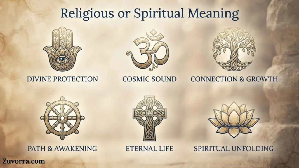
Fast food symbols generally have no inherent religious or spiritual meaning. They are commercial marks created to identify restaurants and products.
A crown, star, bell, fish, flame, or human portrait may have religious meanings in other contexts. Inside a restaurant logo, however, the design usually serves a brand-specific purpose.
Context prevents misinterpretation:
- A crown in sacred art may represent divine or royal authority.
- A crown in a restaurant logo may communicate leadership or connect with a brand name.
- A fish in a religious setting may carry Christian meaning.
- A fish on a menu commonly identifies seafood.
- A star may represent guidance in religion but quality, popularity, or decoration in advertising.
Some restaurants display halal, kosher, vegetarian, or other dietary certification symbols. These are not decorative brand symbols. They may indicate compliance with defined standards, so diners should confirm the certifying organization and the location covered by the mark.
Digital and Technical Meaning
In digital systems, fast food symbols help users complete actions quickly.
Map icons
A fork-and-knife symbol usually marks a restaurant category. A burger icon may narrow the meaning to fast food or casual dining.
Delivery apps
Common symbols include:
- Bag: takeout or completed order
- Scooter or car: delivery
- Clock: estimated preparation or arrival time
- Map pin: restaurant location
- Star: customer rating or favorite
- Phone: call the restaurant
- Ticket or tag: discount
- QR code: menu, payment, promotion, or loyalty access
Menu interfaces
Icons may identify spicy food, vegetarian items, allergens, limited-time offers, meals, sides, beverages, or customization options.
Because icon systems vary, customers should read the restaurant’s legend rather than assume every leaf, flame, or crossed-grain sign has the same meaning.
Food emojis
Unicode food emojis are general pictographs rather than official restaurant logos:
- Hamburger
- French fries
- Pizza
- Hot dog
- Taco
- Poultry leg
- Cup with straw
They can express hunger, meal plans, cravings, celebrations, or a specific food choice. Their exact appearance varies by device and platform.
Where Fast Food Symbols Are Used
Fast food symbols appear wherever people need to identify, choose, order, receive, or discuss food.
Common locations include:
- Highway exit signs
- Restaurant storefronts
- Drive-thru lanes
- Menu boards
- Food wrappers and cups
- Delivery packaging
- Shopping malls
- Airports and railway stations
- Mobile apps
- Digital maps
- Television advertisements
- Social media
- Coupons and loyalty programs
- Uniforms
- Toys and promotional merchandise
Their placement changes their function. A tall roadside logo attracts attention, while an app icon helps a returning customer open an ordering platform.
Common Variations
Wordmarks
A wordmark uses the restaurant’s written name as its main identifying feature. Custom lettering can make an ordinary word legally and visually distinctive.
Letter symbols
Initials compress a long business name into a compact mark. KFC, for example, is easier to place on packaging and small digital screens than the full name “Kentucky Fried Chicken.”
Founder portraits
A founder’s face suggests personal history and recipe heritage. Colonel Sanders is the best-known fast food example.
Mascot characters
Mascots may be kings, animals, clowns, chefs, children, or imagined creatures. They make advertising more playful and can communicate without lengthy text.
Food-shaped logos
Burger buns, pizza slices, donuts, tacos, chicken pieces, and cups immediately reveal a restaurant’s main product.
Architectural symbols
Arches, roofs, towers, signs, and storefront outlines can become brand marks. McDonald’s Golden Arches developed from physical restaurant architecture into a simplified global logo.
Regional adaptations
A company may adjust language, menu images, promotional characters, or color balance for a particular market while preserving its central logo.
Common Misconceptions
“Every fast food logo contains a secret message”
Most designs have understandable commercial goals: visibility, recognition, differentiation, and memorability. Viewers may discover accidental shapes, letters, or words, but those interpretations require evidence before being treated as intentional.
“Red and yellow automatically make people hungry”
Color can influence attention and mood, but no color combination guarantees hunger or a purchase. Food aroma, price, menu images, convenience, habit, lighting, and personal preference also matter.
“Wendy’s collar secretly says ‘Mom’”
Some viewers believe the ruffles around Wendy’s collar form the word “Mom.” Wendy’s has previously explained publicly that the effect was unintentional. The broader brand does emphasize family and uses the image of founder Dave Thomas’s daughter, but perceived hidden lettering should not automatically be treated as planned symbolism.
“The Golden Arches were always designed as an M”
The arches resemble an M today, but their origin lies in architectural arches used on early restaurant buildings. The shape later developed into the simplified corporate mark.
“A green restaurant symbol guarantees healthy food”
Green may communicate freshness or plant-based choices, but nutritional quality depends on ingredients, portions, preparation, and the complete meal.
“A mascot is always fictional”
Colonel Sanders represents a real person. Wendy’s red-haired girl was inspired by founder Dave Thomas’s daughter, and the first Wendy’s restaurant opened in Columbus, Ohio, in 1969.
Interesting Facts About Fast Food Symbols
- The Golden Arches began as architecture. Large yellow arches were attached to early McDonald’s restaurant buildings before becoming a corporate symbol.
- A founder can become the logo. KFC keeps Colonel Sanders’s face central to its identity, connecting the chain with a real cook rather than a fictional chef.
- Food containers can become symbols. KFC’s bucket identifies the product, supports group eating, and works as recognizable packaging.
- Building shapes once did the work of app icons. Before smartphones, unusual roofs, towers, and roadside signs helped drivers identify restaurants quickly.
- Square food can carry symbolic meaning. Wendy’s links its square hamburgers with the idea of not “cutting corners,” turning a product shape into a statement about standards.
- Logos often survive major menu changes. Restaurants may introduce breakfast, delivery, plant-based items, or regional products while preserving their core symbol.
- Initials support international recognition. Short names such as KFC are easier to place on signs and packaging across languages.
- Packaging is mobile advertising. Cups, bags, boxes, and wrappers carry symbols beyond the restaurant into streets, offices, vehicles, and homes.
- Silhouette matters as much as color. A strong logo may remain recognizable in black and white, at night, or when partly hidden.
- Digital design favors simplicity. Fine details that work on a large sign may disappear on a phone screen, encouraging cleaner and flatter logo designs.
- Food emojis are not brand marks. A burger emoji represents a food category, while a trademark identifies a particular company.
- Symbols gain emotional meaning through repetition. A logo may begin as a commercial design but later become associated with childhood, travel, celebrations, work breaks, or family routines.
Related Symbols
| Related symbol | Typical meaning | Difference from a fast food logo |
| Fork and knife | General dining or restaurant | Does not identify a specific brand |
| Chef’s hat | Cooking, culinary skill, food preparation | May represent any cook or restaurant |
| Delivery scooter | Food transportation | Describes a service rather than a cuisine |
| Drive-thru arrow | Vehicle ordering route | Gives directions instead of identifying food |
| Coffee cup | Hot beverage or café | May represent coffee shops rather than full meals |
| Shopping bag | Takeout or pickup | Describes order format |
| Flame | Heat, grilling, or spicy food | Meaning depends on the menu or legend |
| Leaf | Freshness or plant-based option | Does not automatically certify vegetarian food |
| Crown | Leadership, prestige, or playful royalty | Has broader meanings outside restaurants |
| Star | Rating, favorite, quality, or promotion | Meaning varies by interface and context |
Fast Food Symbol Decision Guide
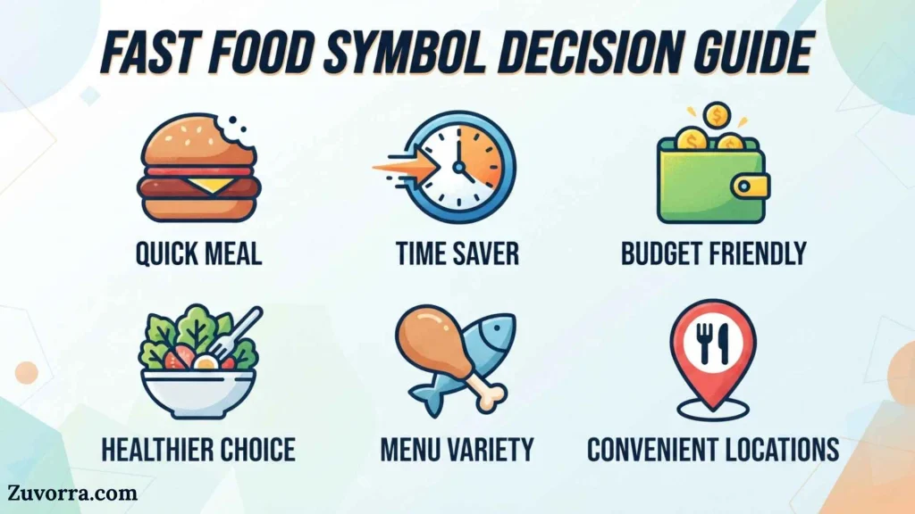
Use the context to identify what a symbol means:
Is it displayed on the restaurant building?
↓
It is probably a brand logo or location marker.
Is it beside a menu item?
↓
It may describe ingredients, spice level, diet, allergens, or a promotion.
Is it inside an ordering app?
↓
It probably represents delivery, pickup, payment, ratings, rewards, or navigation.
Is it on a highway sign?
↓
It identifies nearby food services or restaurant categories.
Does it resemble a religious, medical, or safety symbol?
↓
Check the official legend. Never rely only on visual similarity.
Frequently Asked Questions
What are fast food symbols?
Fast food symbols are visual marks used to represent quick-service restaurants, menu items, and ordering services. They include logos, mascots, burgers, fries, cups, arrows, crowns, bells, founder portraits, delivery vehicles, and app icons. Their main purpose is to help people recognize and choose food quickly.
What do the McDonald’s Golden Arches represent?
The Golden Arches identify McDonald’s and resemble the letter M. Historically, they developed from large yellow arches built into early restaurant designs. Over time, the architectural feature became a simplified logo associated with the company’s food, service system, and worldwide restaurant network.
Why is Colonel Sanders on the KFC logo?
Colonel Harland Sanders was the founder and creator associated with KFC’s Original Recipe. His portrait connects the modern chain with its history, cooking tradition, and distinctive personality. Although the logo has changed over time, KFC states that the Colonel’s face has remained central to the design.
Why do fast food restaurants use red?
Red is highly visible and can communicate warmth, excitement, energy, or urgency. It also contrasts strongly with white, yellow, and black. However, restaurants do not use red for one universal psychological reason, and the color alone cannot force customers to feel hungry or buy food.
Are fast food logos considered symbols?
Yes. A logo is a type of symbol created to identify a business, product, or organization. It gains meaning through its design, trademark use, advertising, customer experience, and repetition. Unlike many ancient symbols, a commercial logo normally has a known owner and a specific branding purpose.
Do fast food symbols have hidden meanings?
Some logos contain intentional visual ideas, such as initials, food shapes, founder portraits, or references to a company’s name. Other supposed hidden messages are accidental patterns noticed by viewers. A claim should be supported by the company or reliable design history before it is presented as intentional.
What does a burger icon mean on a map?
A burger icon usually marks a fast food restaurant, burger restaurant, food court, or casual dining location. Its meaning depends on the map provider’s legend. It may represent a broad restaurant category rather than guaranteeing that every listed business mainly sells hamburgers.
What does a flame symbol mean on a fast food menu?
A flame usually identifies spicy, hot, grilled, roasted, or flame-cooked food. Different restaurants use it differently, so one flame does not represent a universal level of heat. Customers who are sensitive to spicy food should read the menu description or ask restaurant staff.
Is a leaf icon proof that an item is vegan?
No. A leaf may mean vegetarian, plant-based, fresh, environmentally themed, or simply decorative. It does not automatically prove that an item is vegan or free from animal-derived ingredients. Customers should check the restaurant’s definition, ingredient list, and cross-contact information.
Why are simple fast food logos so memorable?
Simple logos use clear silhouettes, limited shapes, bold contrast, and repeated exposure. These features make them easier to recognize on distant signs, small packages, moving vehicles, and smartphone screens. Familiar customer experiences then add emotional and cultural meaning to the visual design.
Key Takeaways
- Fast food symbols represent quick meals, convenience, familiar service, and specific restaurant brands.
- They include logos, mascots, food pictograms, colors, packaging, and digital service icons.
- Many modern symbols developed from roadside signs and restaurant architecture.
- The Golden Arches originated in early McDonald’s building design.
- Colonel Sanders represents KFC’s real founder and recipe heritage.
- Color meanings are flexible and depend on context, culture, and brand history.
- Fast food imagery has commercial meaning rather than inherent religious significance.
- Menu symbols should always be interpreted through the restaurant’s official legend.
- Logos can gain cultural and emotional meaning through repeated public use.
- Claims about secret messages should be supported by reliable evidence.
Conclusion
Fast food symbols are more than decorative pictures. They guide drivers, identify restaurants, explain menu choices, support digital ordering, and connect modern companies with their histories. Their meaning comes from a combination of design, repetition, advertising, architecture, food culture, and customer experience.
From the Golden Arches and Colonel Sanders to burgers, fries, crowns, bells, leaves, flames, and delivery icons, these images help people make quick decisions in busy environments. Understanding fast food symbols also makes it easier to separate documented brand history from popular myths, accidental patterns, and unsupported psychological claims.
References
- McDonald’s Corporation, “McDonald’s History.”
- McDonald’s New Zealand, “Macca’s Story.”
- McDonald’s Canada, “Our History.”
- KFC Global, “Our History.”
- KFC Global, company history and brand information.
- Wendy’s, “The Wendy’s Story.”
- Wendy’s, “Dave’s Legacy: Founding Wendy’s.”
- Wendy’s, “The Square Deal.”
- The Unicode Consortium, official emoji and pictograph standards.

I’m Jasper Huxley, a British writer fascinated by the symbols that communicate ideas without words. I explore their meanings, origins, cultural connections, and everyday uses. From ancient markings to contemporary signs, I enjoy uncovering the stories behind visual language and presenting symbolism in a clear, engaging way for curious readers worldwide.
Books:
- The Hidden Language of Symbols
- Symbols, Signs and Their Meanings